
Prepositions of Place and Movement

Posted in Uncategorized
Materials

https://www.masterclass.com/articles/building-materials-guide
Learn more
2de30
Read the text about building materials and answer the questions:
A building material is any substance used to assemble a structure. There are various types of building materials ideal for projects of any scale in the construction industry. Some of the most common building materials include wood, steel, concrete, and bricks. Wood is a popular choice for residential construction due to its affordability and versatility. Steel is often used in commercial construction because of its strength and durability. Concrete is a versatile building material that can be used for everything from foundations to walls. Bricks are a popular choice for their durability and aesthetic appeal.
- What is a building material?
- What are some of the most common building materials?
- Why is wood a popular choice for residential construction?
- Why is steel often used in commercial construction?
- What is concrete used for?
- Why are bricks a popular choice for construction?
Posted in Uncategorized
History of Photography
Posted in Uncategorized
Halloween: a Celtic tradition
Halloween ia a celebration of Celtic origin. It came to the United States through Irish settlers. Nowadays, it is celebrated in many countries, including Spain, although in Spain we have our own traditions to honour our dead relatives. All Saints Day is on the 1st of November. It is a day to commemorate and pay respect to the saints and loved ones by returning to your hometown and laying flowers on the graves of family members. These community celebrations are traditional and religious, more solemn and respectful than your typical Halloween parties with ghosts.
In Mexico, they celebrate Dia de los Muertos in a different way. In the movie Coco, we can see and understand how Mexicans celebrate it.
Posted in Uncategorized
Library Day

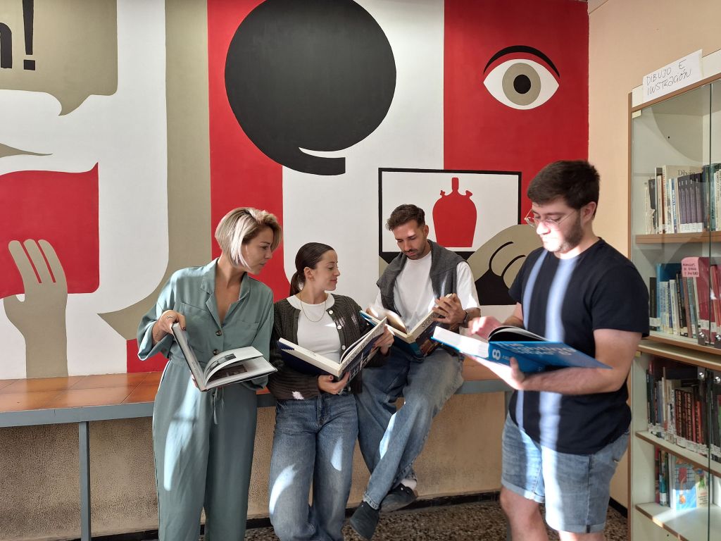
This is a great initiative to promote reading and show the library spaces and their importance.
In Spain, we have celebrated ‘Library Day’ on the 24th of October every year since 1997 to commemorate the destruction of the Sarajevo National Library, set on fire in 1992 during the Balkans War. It’s an initiative from the Asociación Española de Amigos del Libro Infantil y Juvenil, (Spanish Association of Friends of the Children and Young Adults Book) in collaboration with the Ministry of Culture.“
Source: International Library Days (wordpress.com)


Posted in Uncategorized
Schools for sale
Answer these questions about the video:
- What are the jobs of the three people talking?
- What uses were they thinking of giving to the building?
- What use did they give it in the end?
- How many apartment units did they build?
- How many bedrooms did each apartment have?
- What’s the rent the tenants have to pay?
- Write something about the renovation.
Posted in Uncategorized
Description of an object

Describe an object: object, corners, edges, points, material, surface, colour, etc, using specific vocabulary.
Posted in Art&Design
Colours and their meaning


Source: https://socialpubli.com/blog/colours-and-their-meaning-on-social-media/
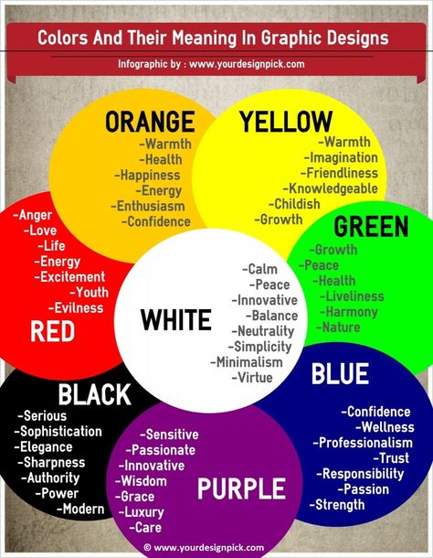
Colours have meanings, we all know this. Depending on it they cause different reactions, and this is something brands make use of as they integrate colours on their strategies: they transmit an image, a personality and a message. In social networks especially, colours are an efficient tool to reach users, arouse feelings and make them go emotional. What are social media brands trying to transmit with their colours, logo and image? How does it affect branding? Today we reveal the truth about colours and their meaning on social media.
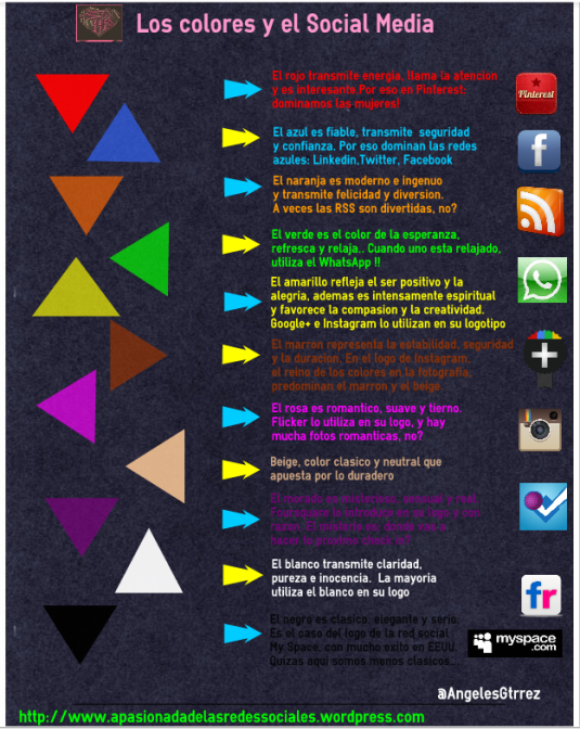
Red: it represents attention, energy, vitality and speed. Now you understand why Pinterest has a red logo, are we not right?
Blue: it transmits safety, reliability, confidence and transparency. This is why most social networks are bluish! Facebook, Twitter, LinkedIn, Tuenti…
Orange: modern, inocent, innovative and especially HAPPY AND FUNNY. Social networks are for joy ?.
Green: symbolizes the natural, hope, coolness and relaxation. Is there anything more natural than Whatsapp?
Yellow: it represents optimism and joy. People also say that it stimulates creativity and compassion. Yellow features the logos of Google+ and Instagram, but it is not very characteristic of any social network given its bright tonality.
Brown: for durability and stability. It is associated especially with Instagram. Moments you capture forever!
Pink: romantic, tender, nice and soft. Flickr has it on its image, although it is not predominant. We all have a romantic picture. Or not?
Purple: it represents luxury, mystery, reality and sensuality. What can be more mysterious than the random check ins on Foursquare?
White: purity, cleanness, peace and innocence. It is hard to see, so it is always used in combination with other colours. Almost all networks use it… Go have a look!
Black: elegant, sophisticated, simple and sober. Just like with white, it does not work very well on its own: it is too dark and serious. MySpace tried it, but we can see that it did not work very well.
Now you know, add colour to life ?. Do it wisely, but do it the way you like!
Visit our influencer marketing agency in New York.

From Arts&Crafts, McGraw Hill.
Posted in Uncategorized


